The Challenge
As Caribou (formerly MotoRefi) evolved from a single-product startup into a growing fintech platform, it became clear that the customer experience hadn’t kept pace.
Users entering the application flow were often met with long, cumbersome forms, duplicate requests for information, and disconnected screens that didn’t reflect the clarity or confidence of the new Caribou brand.
The refinance journey was functional—but clunky. It worked, but it didn’t feel intuitive. It certainly didn’t build trust.
That’s where we came in.
Our Mandate
We weren’t just updating the UI. We were reimagining what the experience could feel like, starting with a deceptively simple question:
What if refinancing a car loan could be as easy as a one-click experience?
Our goal was to streamline the end-to-end flow, reduce friction at every touchpoint, and make the experience feel fast, smart, and supportive, without sacrificing compliance, transparency, or functionality.
This meant aligning product, design, and engineering teams around a shared vision—and co-creating a new experience from the inside out.
The Process
We kicked off with a design breakout session focused entirely on the “one-click refinance” vision. This wasn’t just a brainstorm—it was a collaborative sprint involving designers, PMs, engineers, and operations leaders.
To unlock broad thinking, we used the Crazy 8s framework. In just eight minutes, each participant sketched eight distinct ideas, forcing quantity over perfection and surfacing unexpected possibilities.
The energy was real—this exercise broke down silos and brought everyone into the ideation process. It helped the team shake off the constraints of “how it works now” and start imagining “how it should feel.”
Following that, we conducted deep-dive strategy workshops to dissect the existing refinance funnel. We mapped each step, called out redundancies, flagged inconsistencies, and aligned on which parts needed redesign vs. retirement.
Designing the Future Flow
With the foundational insights in place, we began to prototype.
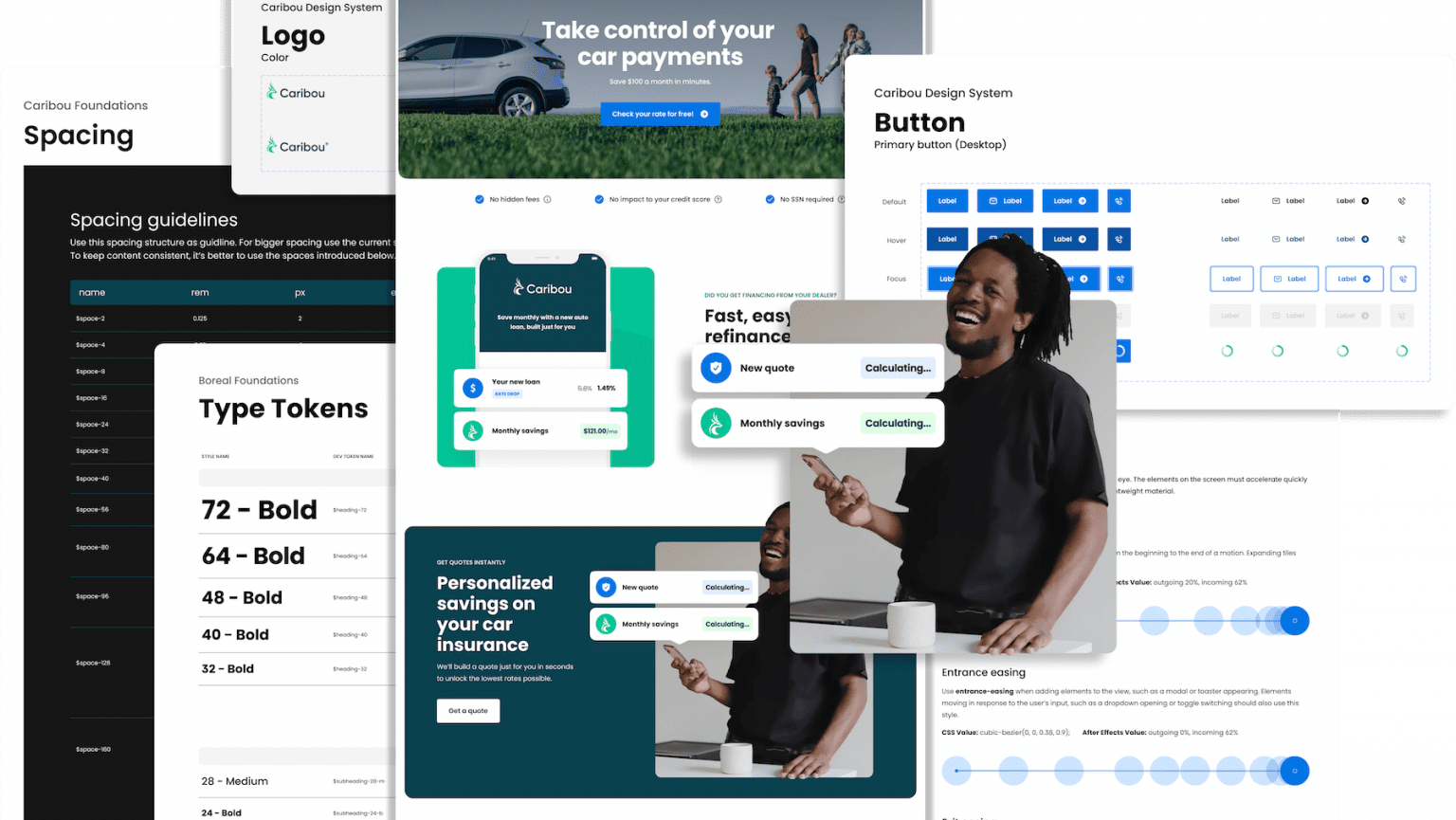
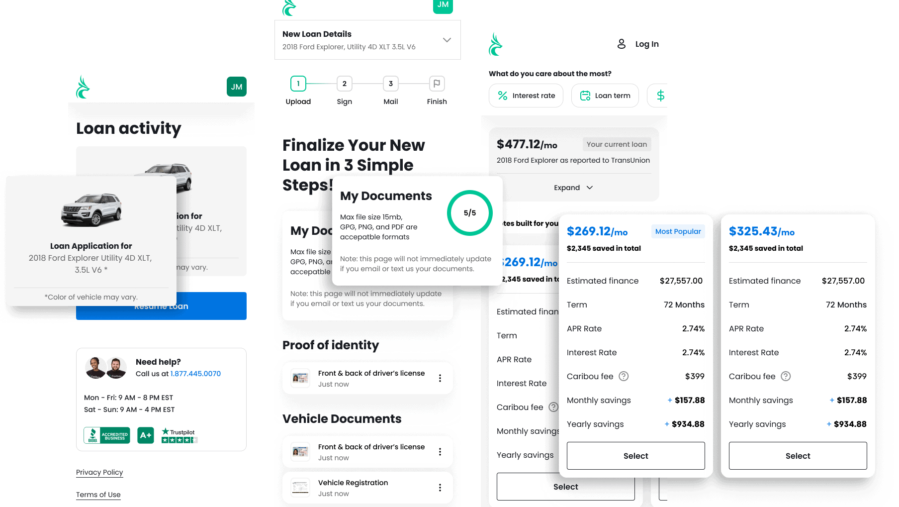
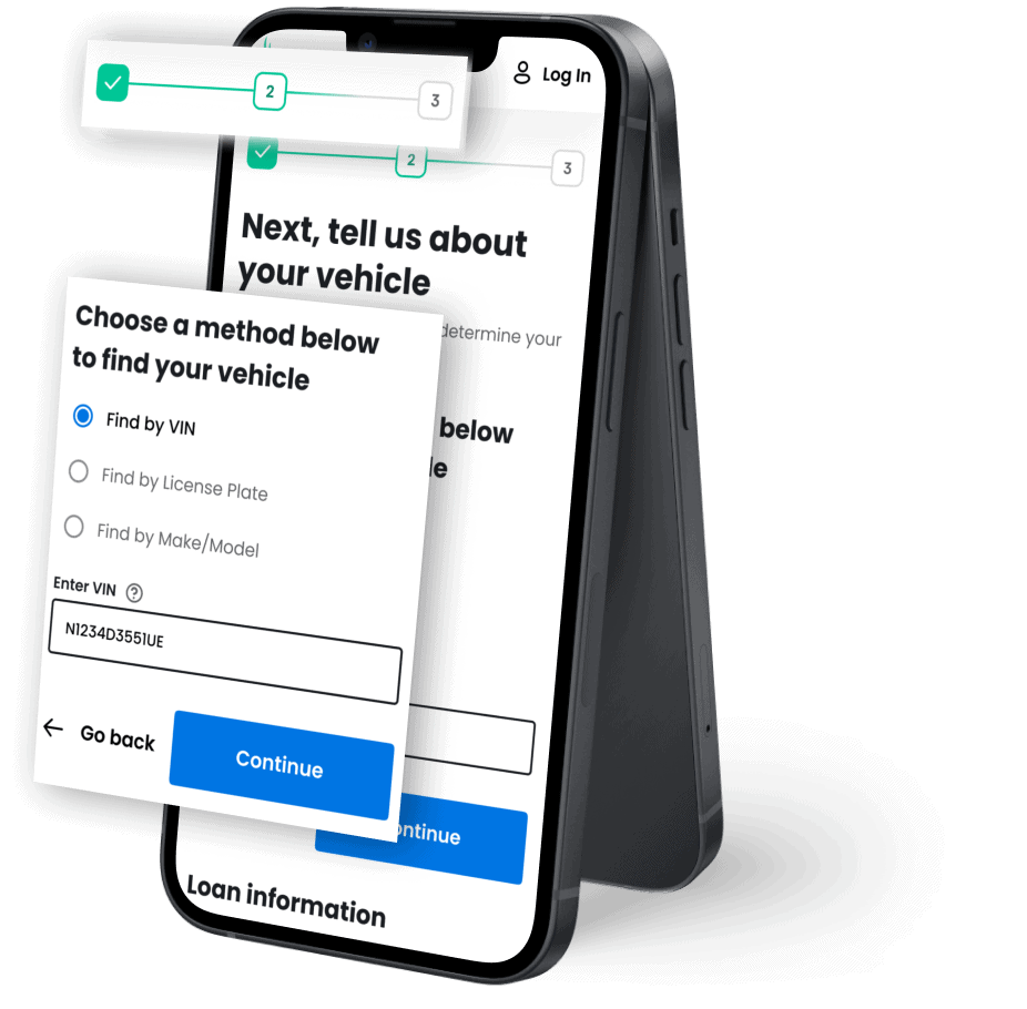
The low-fidelity wireframes were optimized for flow clarity and emotional resonance. We shortened the path, grouped information more logically, and reduced the cognitive load at each step.
From login to loan estimate, the new flow was faster, more focused, and less repetitive. Error states were standardized. Input fields were cleaner. Visual cues aligned with the updated Caribou brand.
Most importantly, we built toward one-click refinance not just as a metaphor, but as a design north star.
A Human-Centered Approach
Throughout the process, we stayed rooted in empathy.
Borrowers aren’t just navigating forms, they’re making major financial decisions. We designed every touchpoint with that weight in mind. Copy was rewritten for clarity and tone. Confirmation moments were made more reassuring.
We moved away from dense, transactional interfaces toward experiences that felt guided, transparent, and human.
This wasn’t just a new interface. It was a new relationship between Caribou and its users.
Results
The final prototype brought together the best of Caribou’s evolving identity, paired with a frictionless, mobile-first application flow.
We delivered a cleaner, faster, and more confidence-inspiring refinance experience that aligned with the company’s growth into a trusted financial partner.
The new journey laid the foundation for future enhancements—including personalization, embedded insurance options, and real-time savings estimates.
And while we didn’t literally reduce the process to a single click, we made it feel that easy.
Which, sometimes, is even better.