Approach
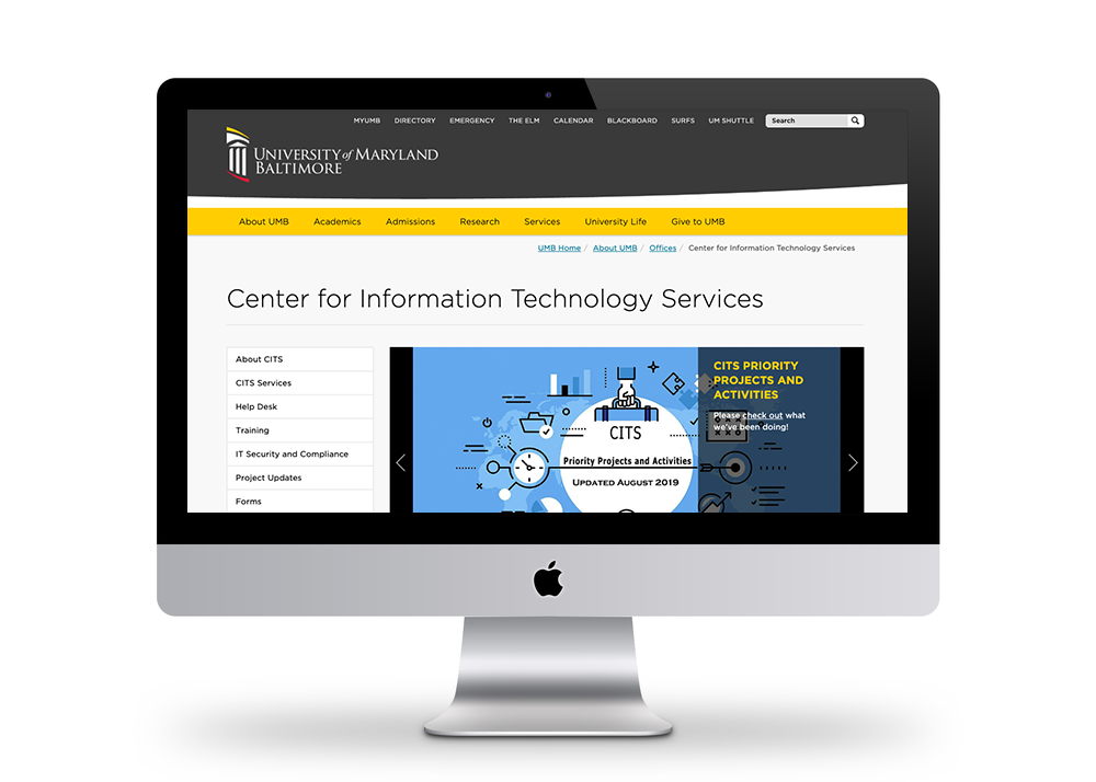
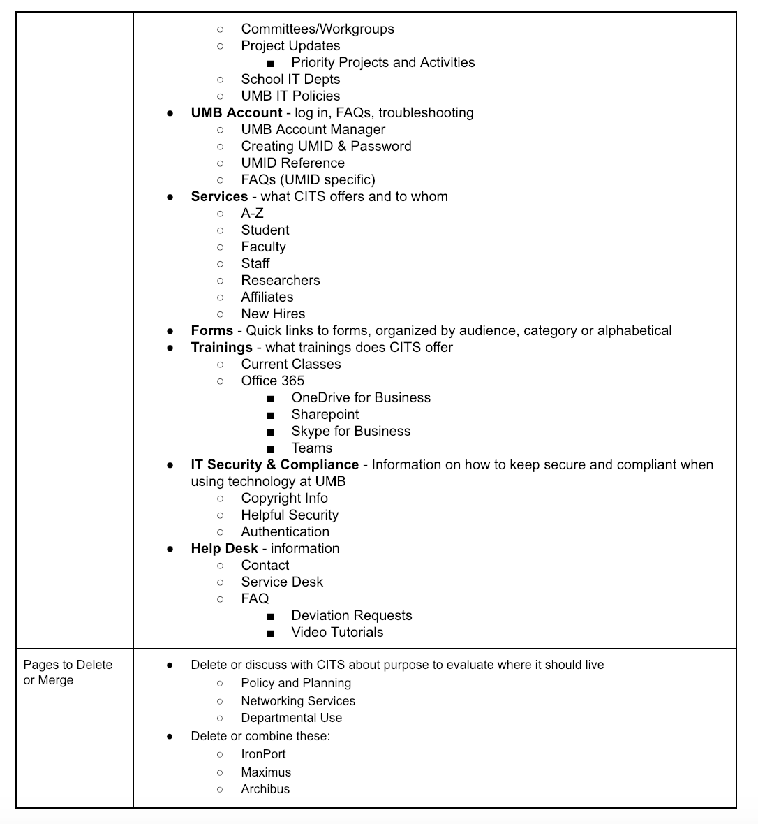
We conducted a content inventory of UMB’s Center for Information Technology Services website in order to survey and catalogue the content structure in preparation for the site’s redesign. We combed through 198 individual site pages, dividing the information we found into 15 key areas, 3 of which were pulled from Google Analytics (see “Column Descriptions”). We made observations and notes throughout regarding both positive and challenging aspects of the site that we believe will help guide us during the next stages of the site’s redesign .
We conducted a content inventory of UMB’s Center for Information Technology Services website in order to survey and catalogue the content structure in preparation for the site’s redesign. We combed through 198 individual site pages, dividing the information we found into 15 key areas, 3 of which were pulled from Google Analytics (see “Column Descriptions”). We made observations and notes throughout regarding both positive and challenging aspects of the site that we believe will help guide us during the next stages of the site’s redesign .
Summary Findings
Based on our Content Inventory, we identified three sections to focus on as we head into the research, strategy and personas stage of the redesign process.
Based on our Content Inventory, we identified three sections to focus on as we head into the research, strategy and personas stage of the redesign process.
Navigation
Several pages are missing from navigation and they were not linked from the page that the breadcrumbs indicated. The breadcrumbs are only so helpful, as they only include a limited set of pages. Frequently you can’t get back to the linking page.
Several pages are missing from navigation and they were not linked from the page that the breadcrumbs indicated. The breadcrumbs are only so helpful, as they only include a limited set of pages. Frequently you can’t get back to the linking page.
The left navigation bar (local navigation) didn’t always become active to show that you were on the page that was listed there.The drop down accordions should show an active state (currently the arrow disappears when the accordion is active). We also saw in the case of Level 3 pages as they would sometimes appear highlighted for pages that are supposedly linked from them but in actuality, they are not.
Content
Labels and titles seem “insider baseball” and not informative requiring you to read the subtext in order to understand the page’s purpose and target audience. In general, the content on the page uses a lot of jargon and it seems like it’s assumed all users have the same base of knowledge— is that likely?
Labels and titles seem “insider baseball” and not informative requiring you to read the subtext in order to understand the page’s purpose and target audience. In general, the content on the page uses a lot of jargon and it seems like it’s assumed all users have the same base of knowledge— is that likely?
We’ve noticed that a lot of pages are filled with pure information and provide no actionable next steps for the user.
There are many pages dedicated to bios and PR for one person (i.e. staff directory) that should be consolidated and/or structured differently so that the user has the ability to know what a person on the list does if they need to contact them.
Finally, we noticed some pages don’t have any content on them just a list of links and with that, we noticed a lot of those links were broken, requiring the user find the information elsewhere.
Layout
Some pages require a lot of scrolling, the columned template forces you to use vertical space. The vertical format is limited and often not the best way to format information in a way folks can process. Visually sort of easy to gloss over and miss information. While the use of dropdown menus were nice to prevent lots of scrolling, they do not collapse once you click on another one, you must manually close each one.
Some pages require a lot of scrolling, the columned template forces you to use vertical space. The vertical format is limited and often not the best way to format information in a way folks can process. Visually sort of easy to gloss over and miss information. While the use of dropdown menus were nice to prevent lots of scrolling, they do not collapse once you click on another one, you must manually close each one.
The manuals and getting started documentation is not consistent in formatting or location. It’s unpredictable where in the hierarchy it will fall and housed very deep into most of the software topic verticals
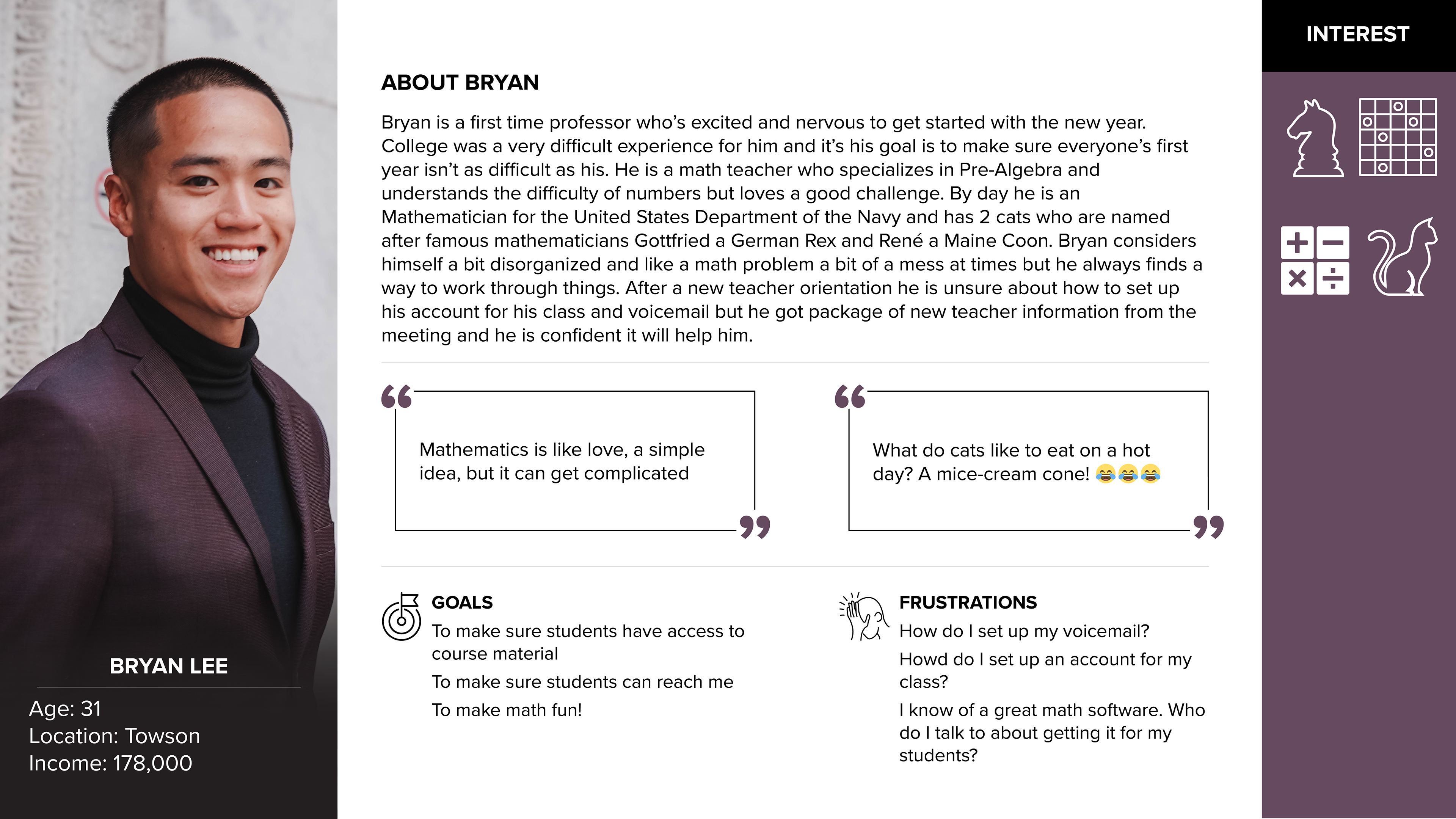
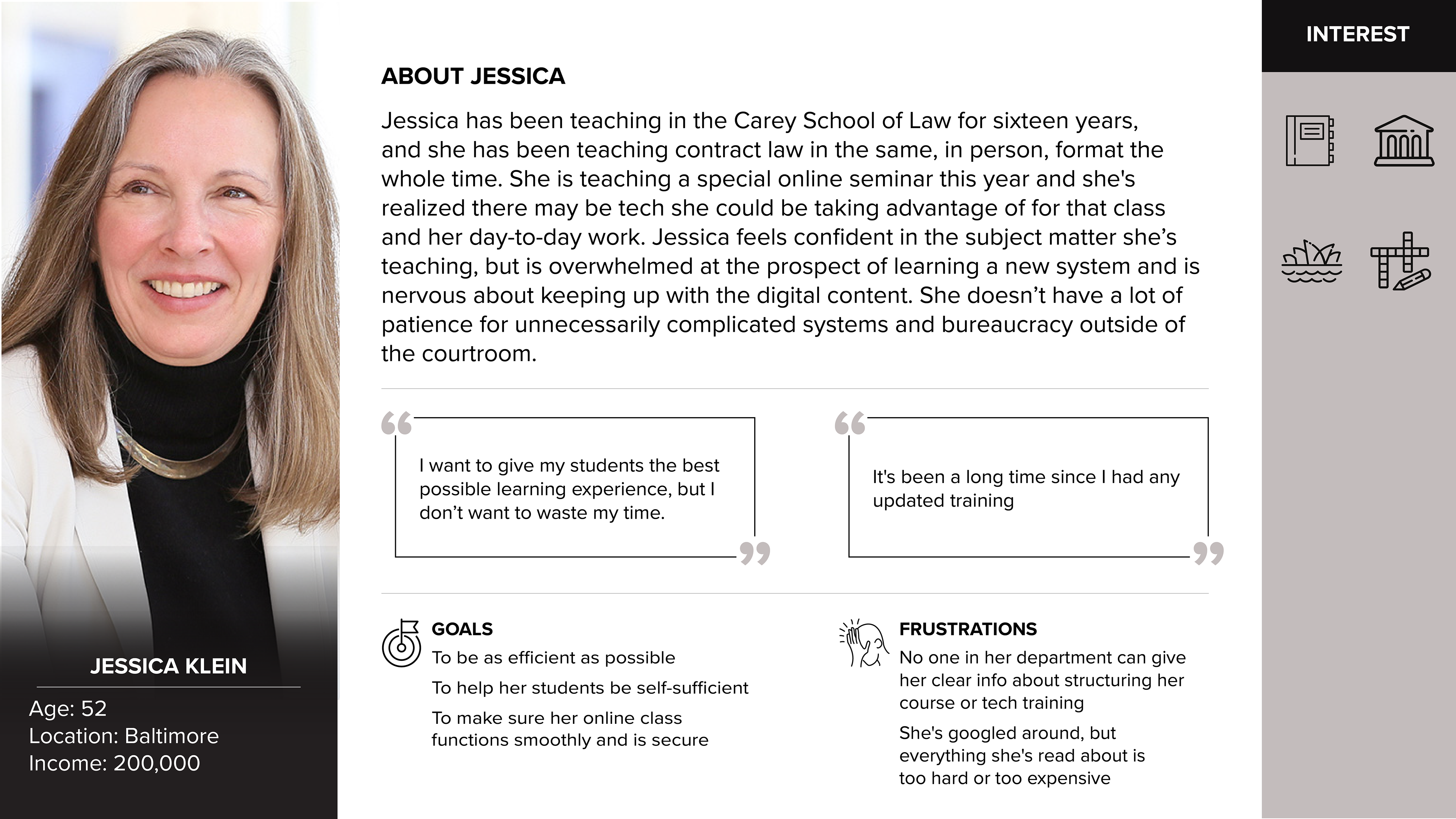
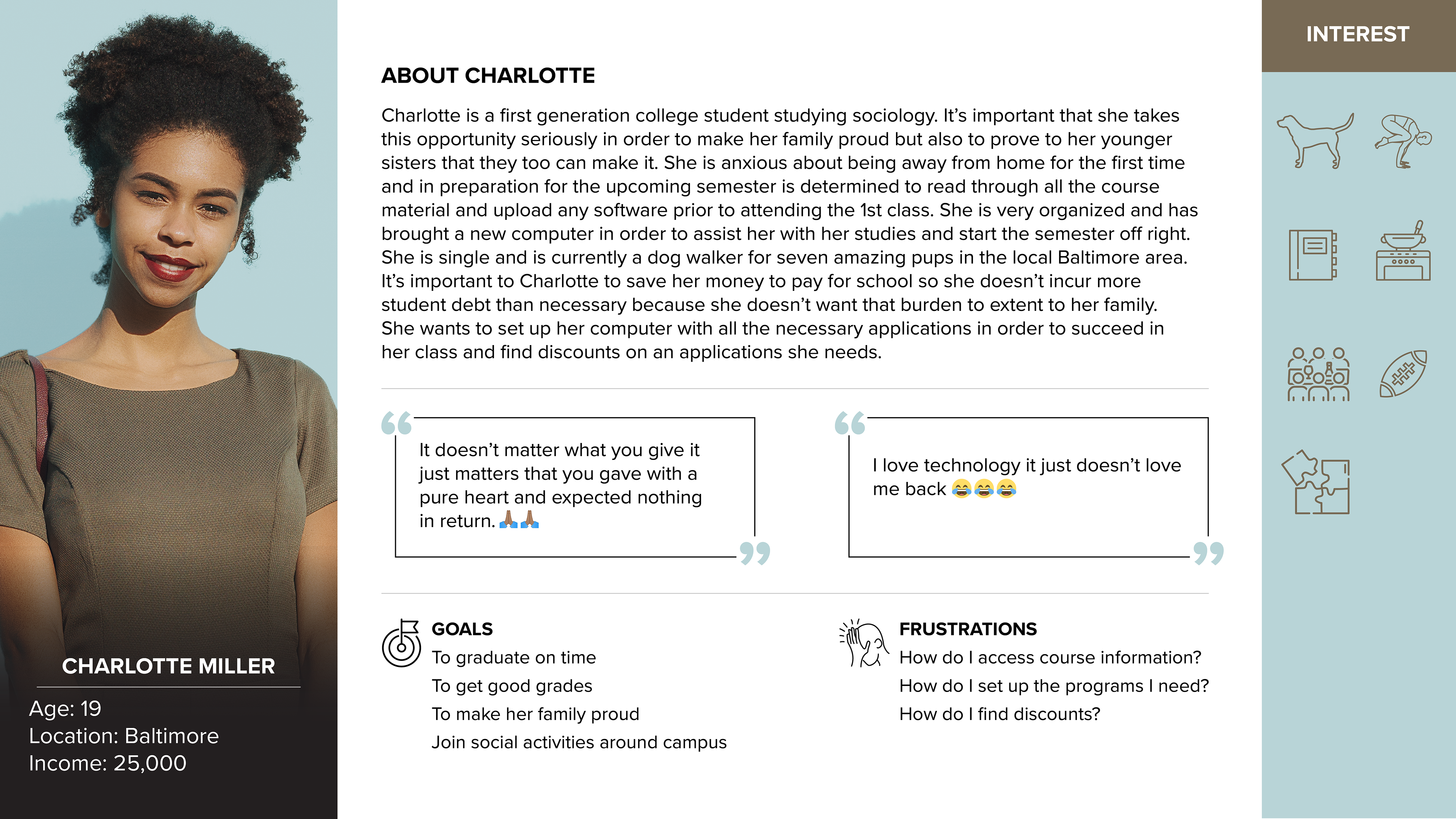
Personas
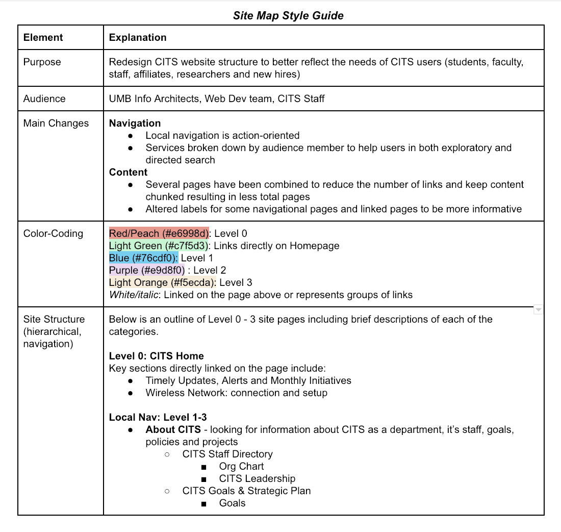
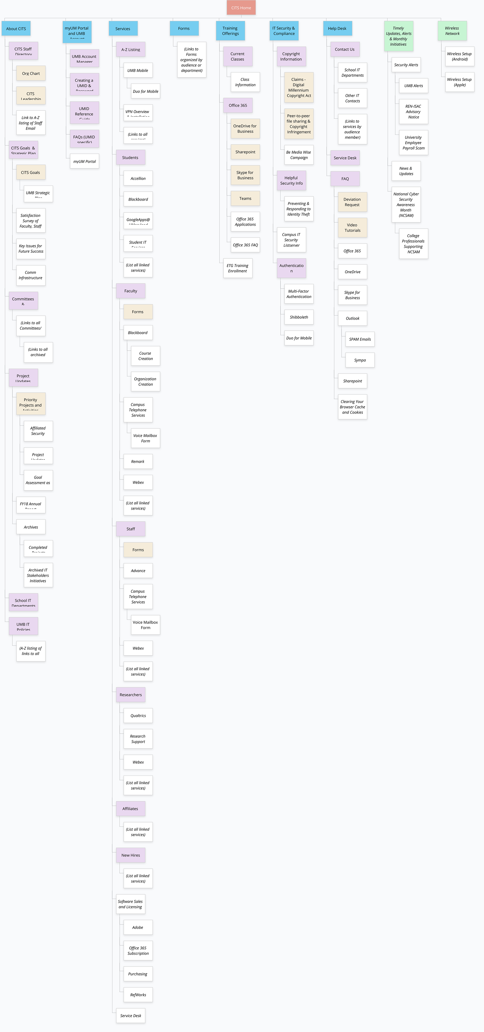
Site Map Color-Coding
Redesign CITS website structure to better reflect the needs of CITS users (students, faculty, staff, affiliates, researchers and new hires)
Redesign CITS website structure to better reflect the needs of CITS users (students, faculty, staff, affiliates, researchers and new hires)
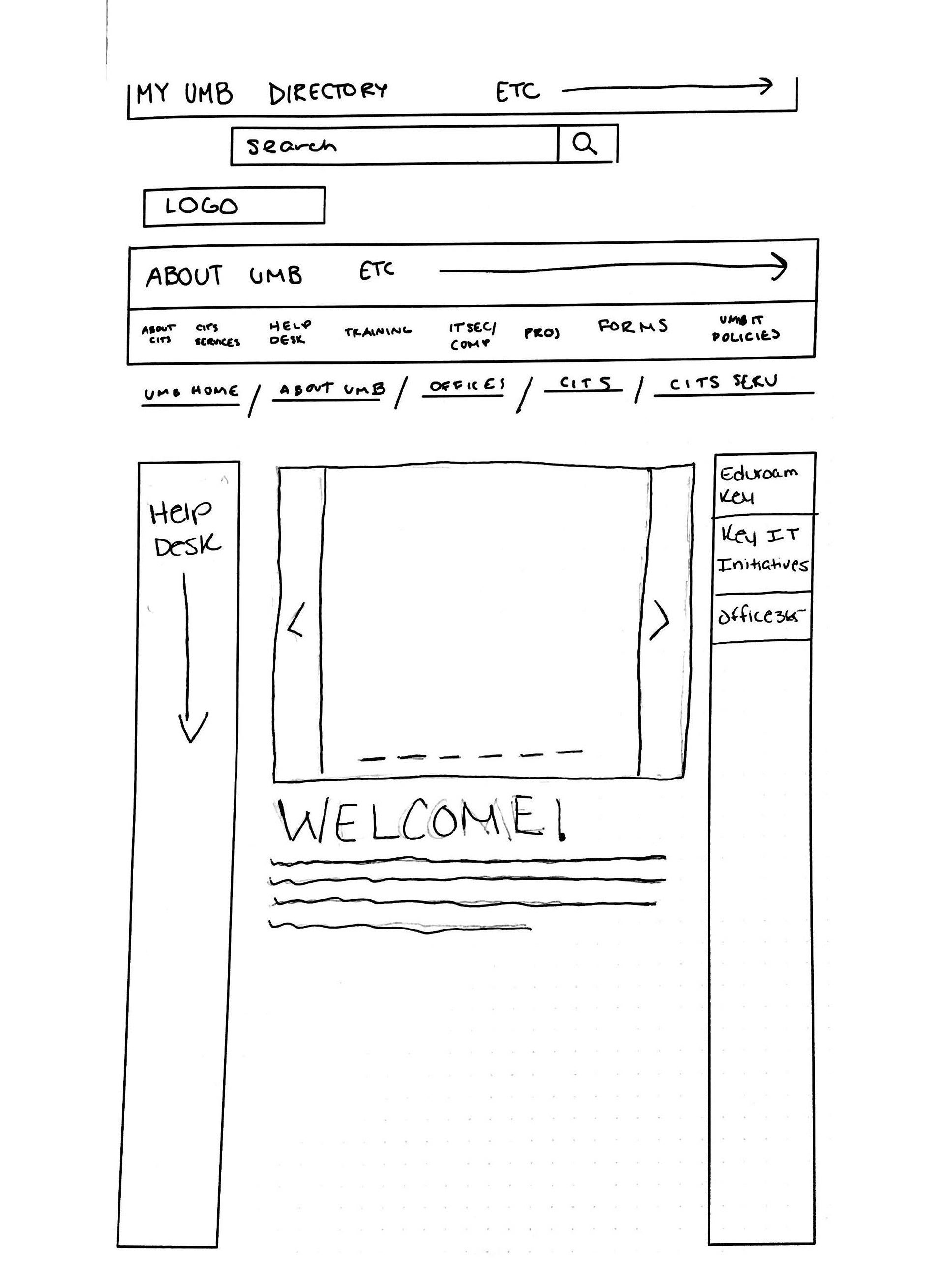
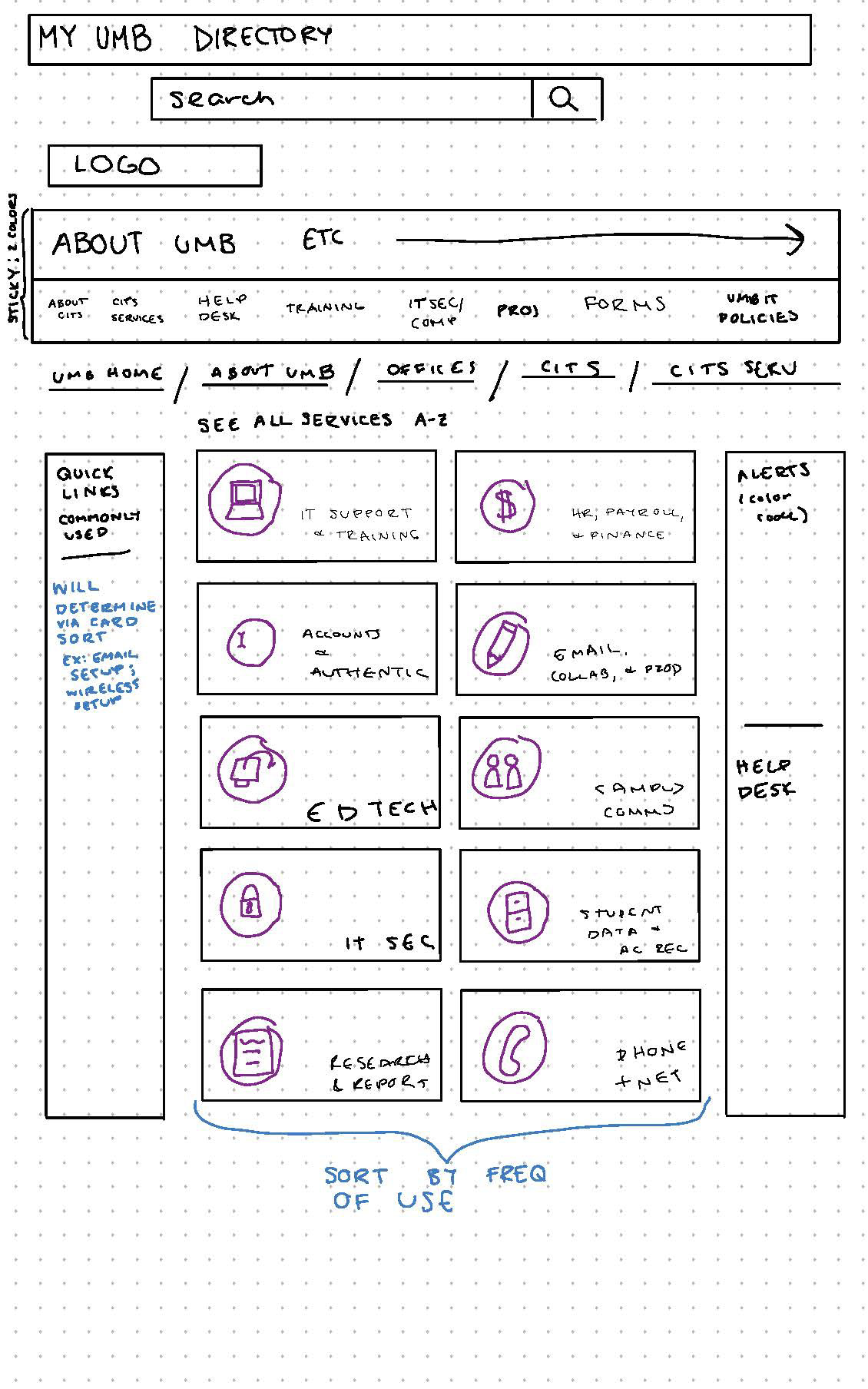
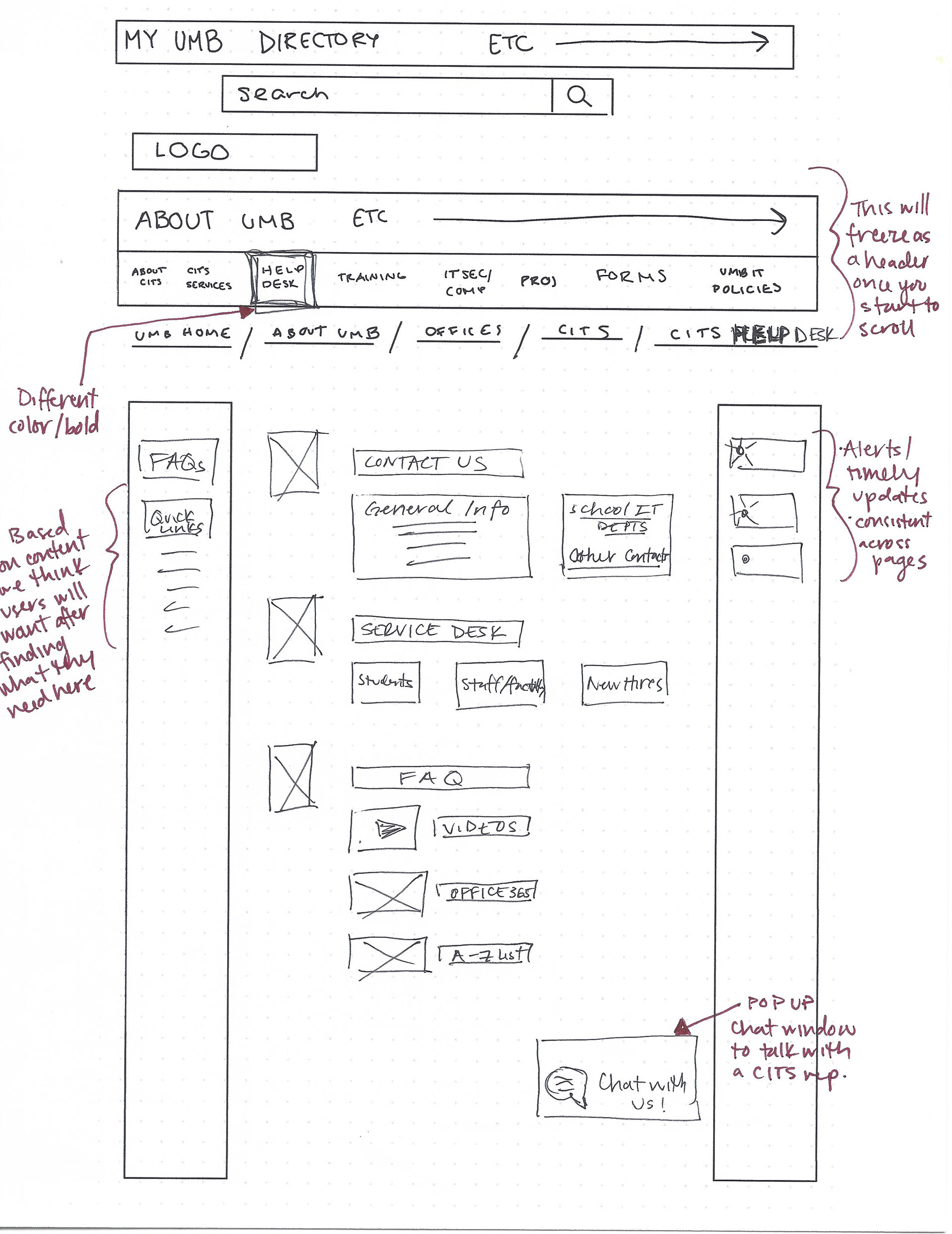
low fidelity wireframes
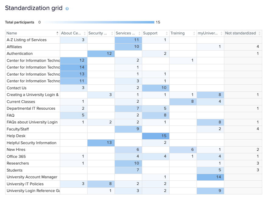
Card Sorting
Card sorting was used to help design the information architecture of our site. We used a combination of open and closed card sorting to give the participants the ability to capture any areas we missed and to restrict them to a predetermined set of category names we thought we’re most valuable. Check out the results of our card sorting exercise.
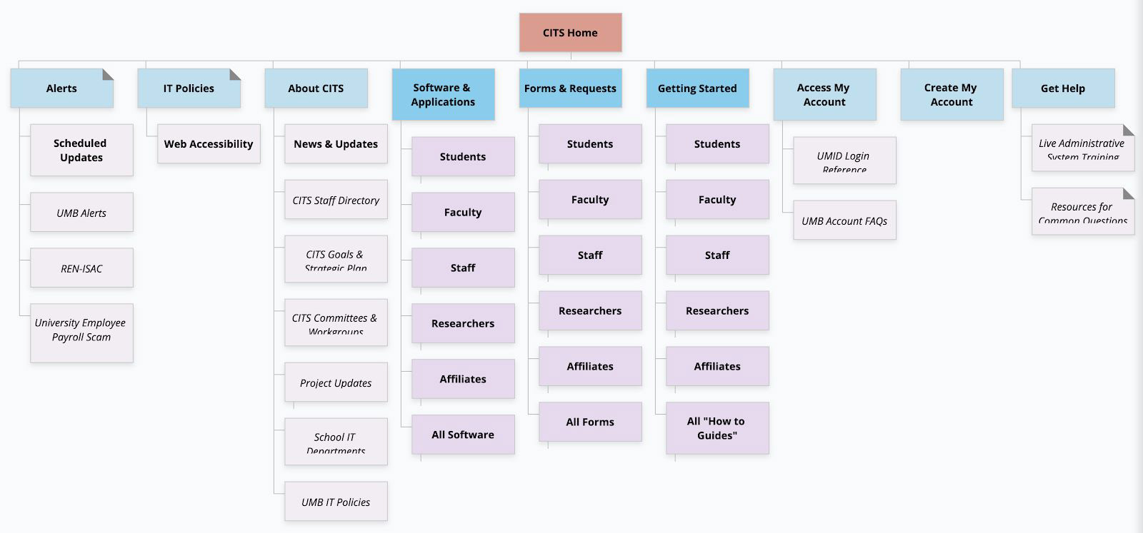
Modified Site Map
Based on the results of the card sorting, our revised site map chunks information into three sections, each of which appears on every page.
The primary navigation at the top of the page sorts the various services and forms into clearer categories — “Software & Applications,” “Forms & Requests,” and “Getting Started.”
The left sidebar contains time-sensitive “Alerts,” “IT Policies,” and “About CITS” — these are informational items that should be readily available to users.
More action oriented content is housed in the right sidebar. That includes University account actions and support. The sidebar consolidates Training, Help, IT Security & Compliance and myUM Portal.
Because each of those sections contains a combination of how-to guides, FAQs, live training resources, and contact information for support, it was redundant to have them in two distinct places.
In addition to these structural changes, we’ve adjusted some language to be clearer for users, which is reflected in the site map.
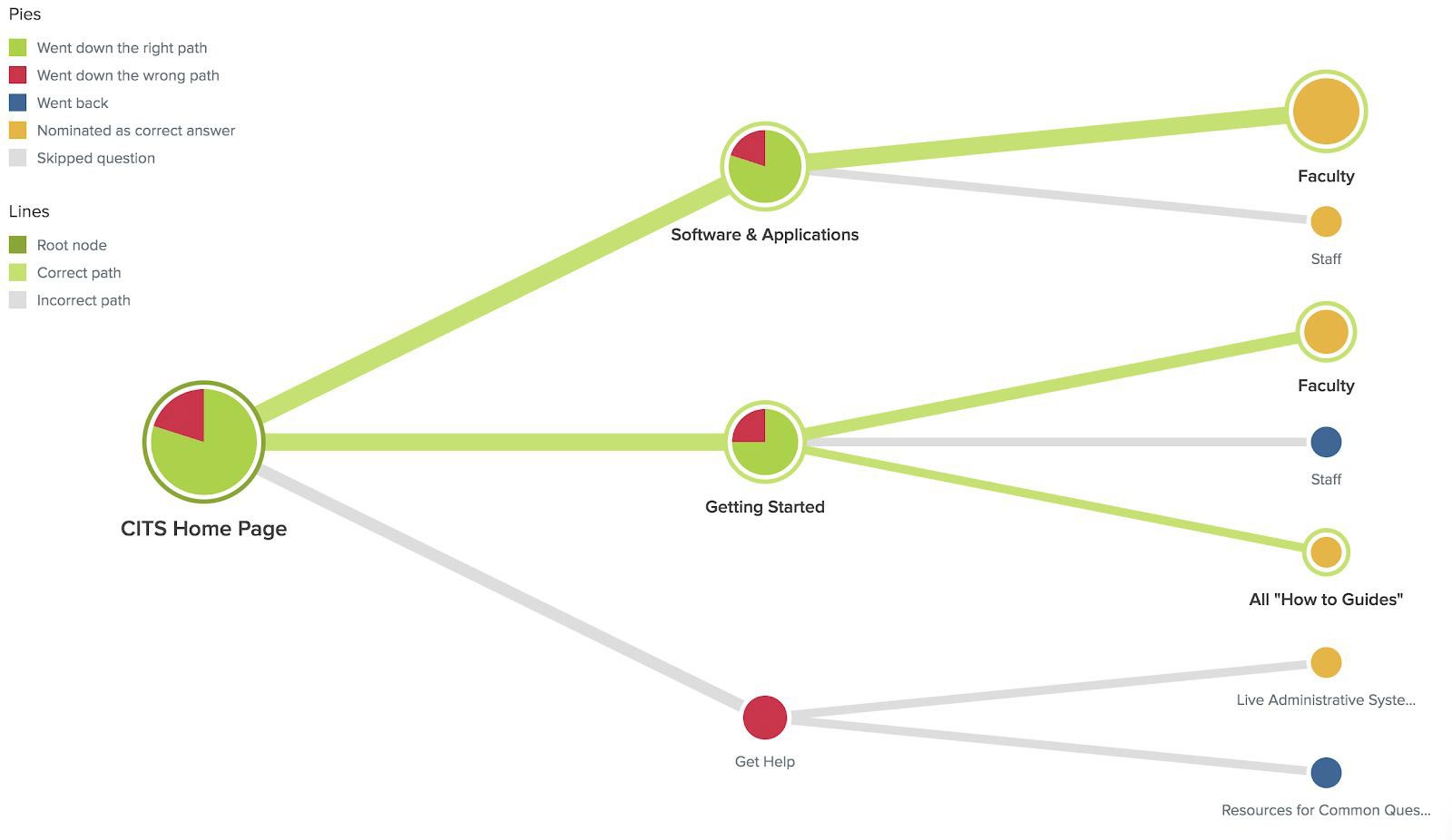
TREE JACK TESTING
To confirm the usability of this site map, we conducted a tree test using Optimal Workshop’s Treejack testing. Tree Testing is a task-based usability technique that assesses the findability of the first two levels of navigation in your site map. We felt this was a logical next step after our card sorting results showed discrepancy amongst where users expected to find specific topics.
We wanted to both assess our new labels and navigation structure to test whether organizing the site’s Level 2 navigation by audience group would increase user’s success rate of finding what they needed on the site. To accomplish this, we presented users with 5 tasks and asked them to select the location on the website where they think they would find the information to complete that task.
We recruited users from our personal and professional network so while some met our target user base, others did not. However, each user was presented with a specific task that asked them to imagine themselves as if they were a specific user (i.e. professor, student, etc.). We acknowledge the limitations of this method and would suggest a round of usability testing with wireframes to confirm our findings.
We conducted a total of 9 unmoderated tests and overall, we found that user’s were able to efficiently find the information that they needed. Participants took an average of 38 seconds per task, completing the 5 tasks in just over 3 minutes on average. 82% of participant answers were chosen without backtracking revealing the intuitive nature of the navigation structure. The overall success rate was 76% which is a great improvement from our card sorting results (only 46% of users agreed on an IA structure).
Some key themes to take into consideration when finalizing our recommendations:
● Results showed that users utilized multiple paths to find key information and expected it to be in
2 key places: under the audience group the user identified with and in the section that housed all information for that category.
● “Getting Started” category appears to be a strong label, indicating tutorials and a location to find resources for those new to the university.
● Usability testing with wireframes will offer insight into the 3-navigational structure and it’s intuitiveness.