Setting the Stage
Caribou (formerly MotoRefi) was evolving fast. What started as a fintech company focused on auto loan refinancing was growing into a full-stack personal finance platform. New product lines were launching. Teams were multiplying. The brand had been refreshed.
But while the business scaled, the user experience hadn’t.
Designers were working in silos, rebuilding components from scratch. Engineers were recoding the same interactions, often with no shared spec. Users were moving through entirely different flows depending on where they clicked, what lender they used, or what experiment they were funneled into.
It wasn’t just inconsistent, it was incoherent.
Across the company, it became clear: we didn’t just need a UI kit.
We needed infrastructure.
Chaos in the Clicks
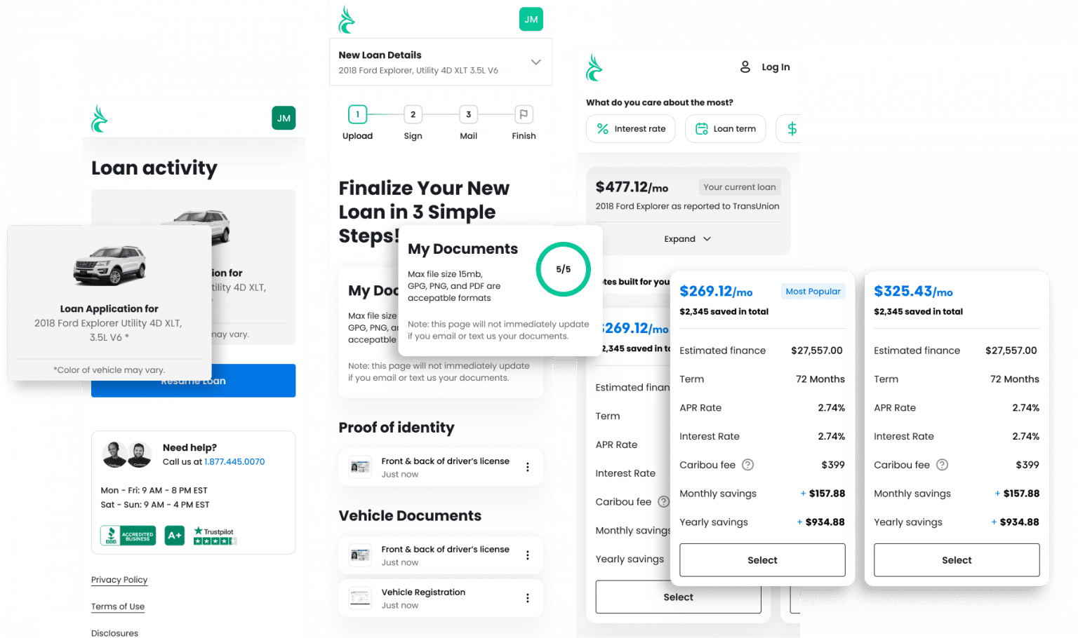
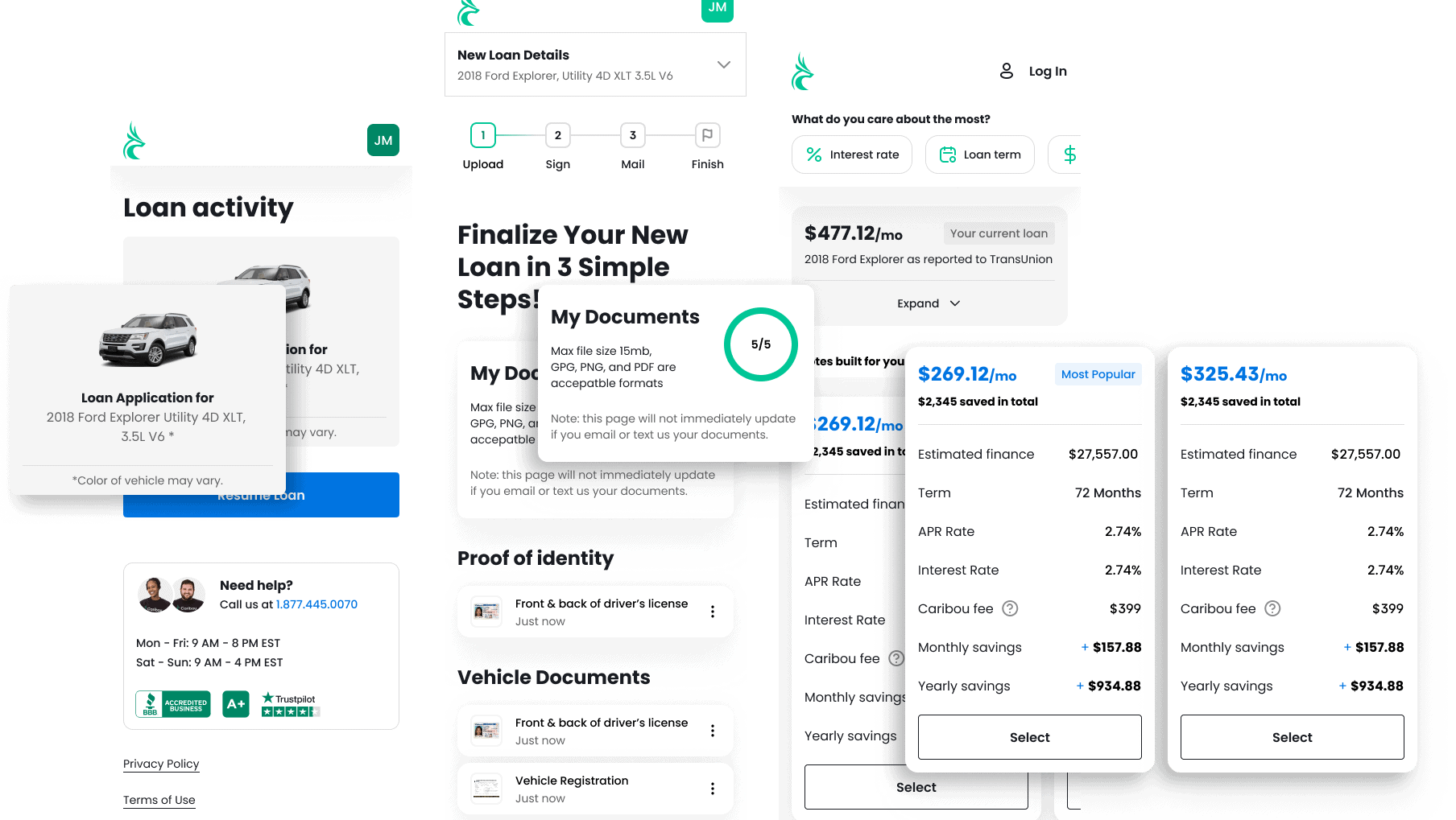
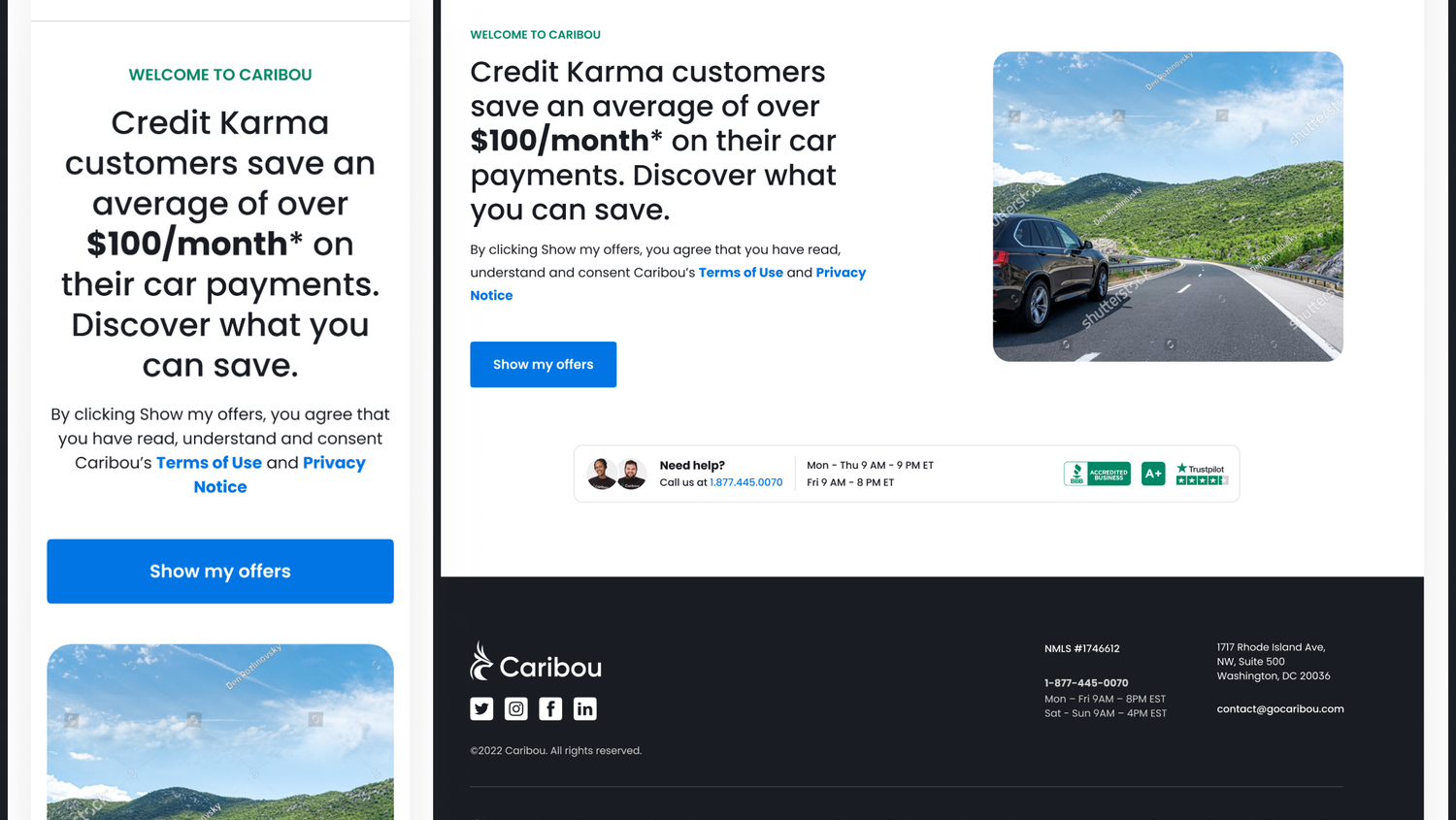
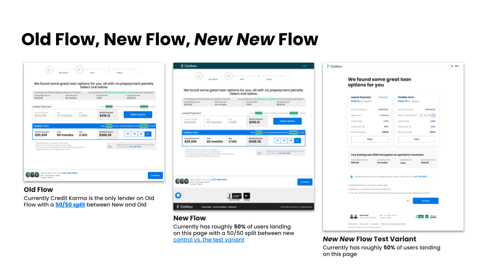
We referred to it (semi-jokingly) as the “Old Flow,” the “New Flow,” and the “New New Flow”—and all three were live, simultaneously. These weren’t stylistic variations. They were fundamentally different experiences: layouts, inputs, error states, CTAs, all behaving and looking differently depending on the path a user took.
The inconsistency wasn’t just visual—it eroded trust.
That matters when you’re helping people refinance their cars or take out a loan. In finance, credibility is UX.
Inside the Ops Reality
It wasn’t only the end user feeling the friction. Our internal teams—especially the contact center—were operating in a tangle of tools.
Agents toggled between Maestro, Airtable, Apollo, RingCentral, DocuSign, Braze, Salesforce, Slack, and various inboxes to move a single lead forward.
There was no source of truth.
Notes were lost in Slack. Docs lived in email chains. Lead status was tracked manually. The strain showed up everywhere: missed handoffs, lagging response times, and avoidable errors.
To fix the product, we had to fix the system—and to fix the system, we had to understand it fully.
The Breakdown Audit
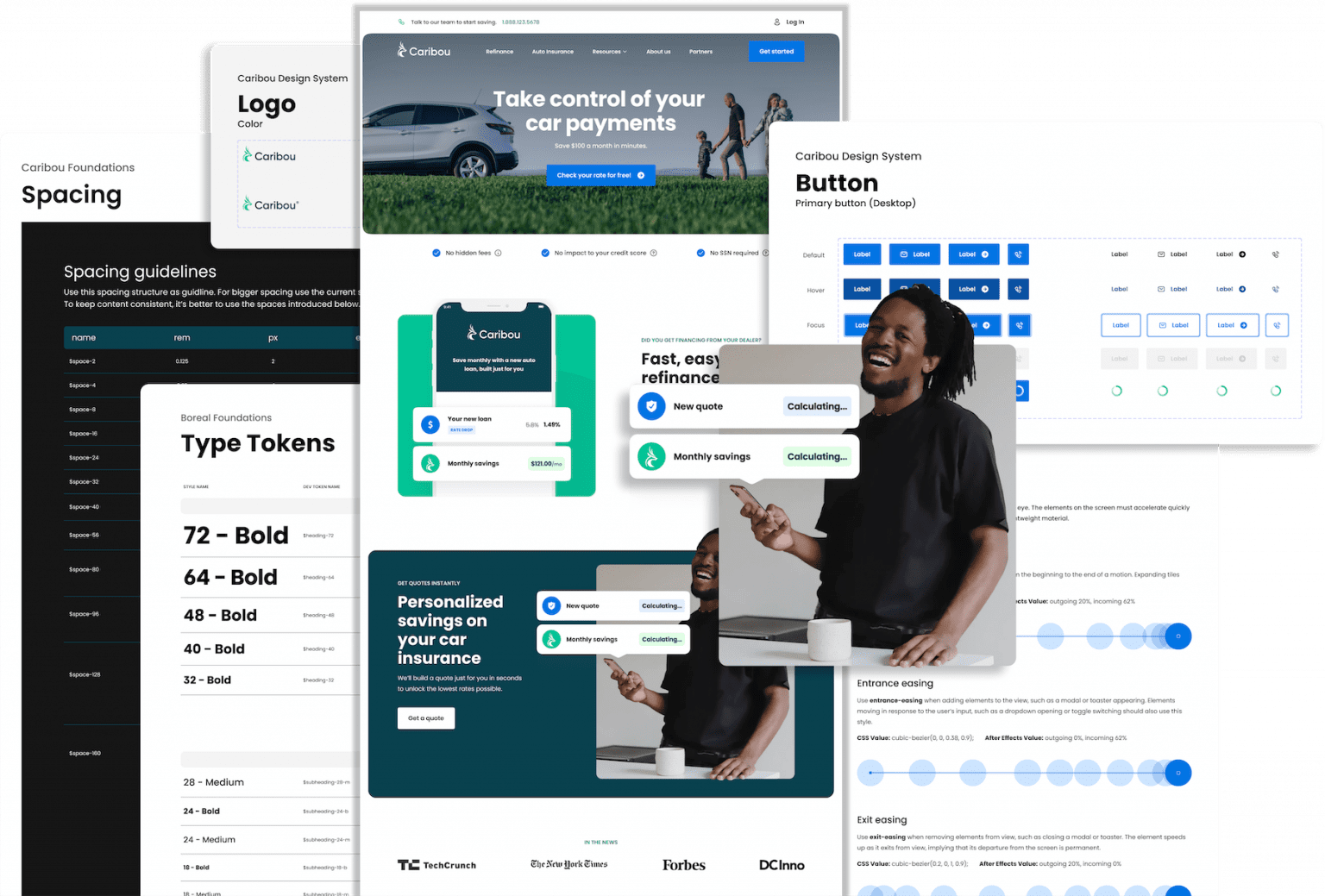
We started with a full component audit—60+ instances of duplication across our design files. Each one told a story: a lack of clarity, a handoff gone wrong, a shortcut that turned into a standard.
Through team interviews, QA bug analysis, and flow-by-flow documentation, we mapped out where things were failing and why.
Even something as simple as the login experience had four different styles for error states. Input fields were styled differently on every screen. Button hierarchies were inconsistent, even when the functions were identical.
We weren’t building a design system from scratch. We were distilling one out of chaos.
Listening to the Right Voices
An unexpected insight came from our internal Loan Officers—team members who used the consumer-facing application daily to guide customers through refinancing.
They weren’t just operators; they were power users.
Their feedback helped us pinpoint which components caused confusion, where savings details weren’t clear, and where trust signals were missing. Their lived experience validated the pain points we saw in our audit—and made it impossible to ignore the gaps.
Making the Business Case
Everyone agreed we needed a design system—but agreement isn’t alignment.
For design and engineering, the value was operational: eliminate duplication, increase velocity, improve accessibility, and build faster.
For leadership, it had to go deeper.
We used a simple formula:
Team Size × Hours Wasted × Hourly Rate.
When you factor in design rework, engineering delays, QA churn, and onboarding inefficiencies, the number was undeniable.
Caribou was losing an estimated $140,000 a month due to fragmented design and development. That’s over $1.7 million a year.
The system wasn’t just a UX investment. It was a financial strategy.
Building the Foundation
We anchored the design system in Atomic Design principles—starting with tokens and building upward into layouts.
We created a shared language across disciplines:
Visual styles became design tokens
Tokens became components
Components became live documentation
Documentation fed directly into engineering
We built modularity into the core. Instead of crafting pages, we crafted systems—making updates easier, implementation faster, and governance smoother.
Tooling & Handoff
The tools made the system work.
Everything started in Figma, where product designers created flows with real-world context and accessibility in mind. Our design systems team then translated those into tokens, specs, and reusable logic.
We used the Figma Tokens plugin to export tokens directly into engineering-friendly formats. Tools like Supernova and Storybook allowed us to close the gap between design intent and developer execution.
Storybook validated behavior. Supernova documented structure. Together, they ensured our system lived beyond the design team.
Governance That Scales
We established a lightweight but structured submission process:
Any designer—regardless of seniority—could propose a component. Proposals were reviewed in a monthly design sync, debated, and either approved, modified, or pointed to an existing solution.
Once scoped and assigned, the component was built, validated, and routed through cross-functional review, including engineering, legal, and leadership.
Approved components were documented in Slab, published in Figma, and distributed via Supernova to our engineering teams.
We didn’t just build components. We built a process for change.
The Outcome
This wasn’t a visual upgrade. It was a culture shift.
Designers had clarity. Engineers had alignment. Stakeholders had confidence.
New hires ramped faster. Existing teams moved quicker.
Users saw consistent, credible interfaces no matter where they landed.
The system created structure, speed, and scale.
Most importantly, it built trust.