Overview
During my time at Caribou, I worked across multiple touchpoints of the user journey—from the login experience to refinancing flows, offer generation, and partner integrations. I led design updates across both the marketing site and the internal dashboard, but this case study focuses on one of the most high-impact projects: rethinking the Offer Generation Page and optimizing partner landing experiences.
The Challenge
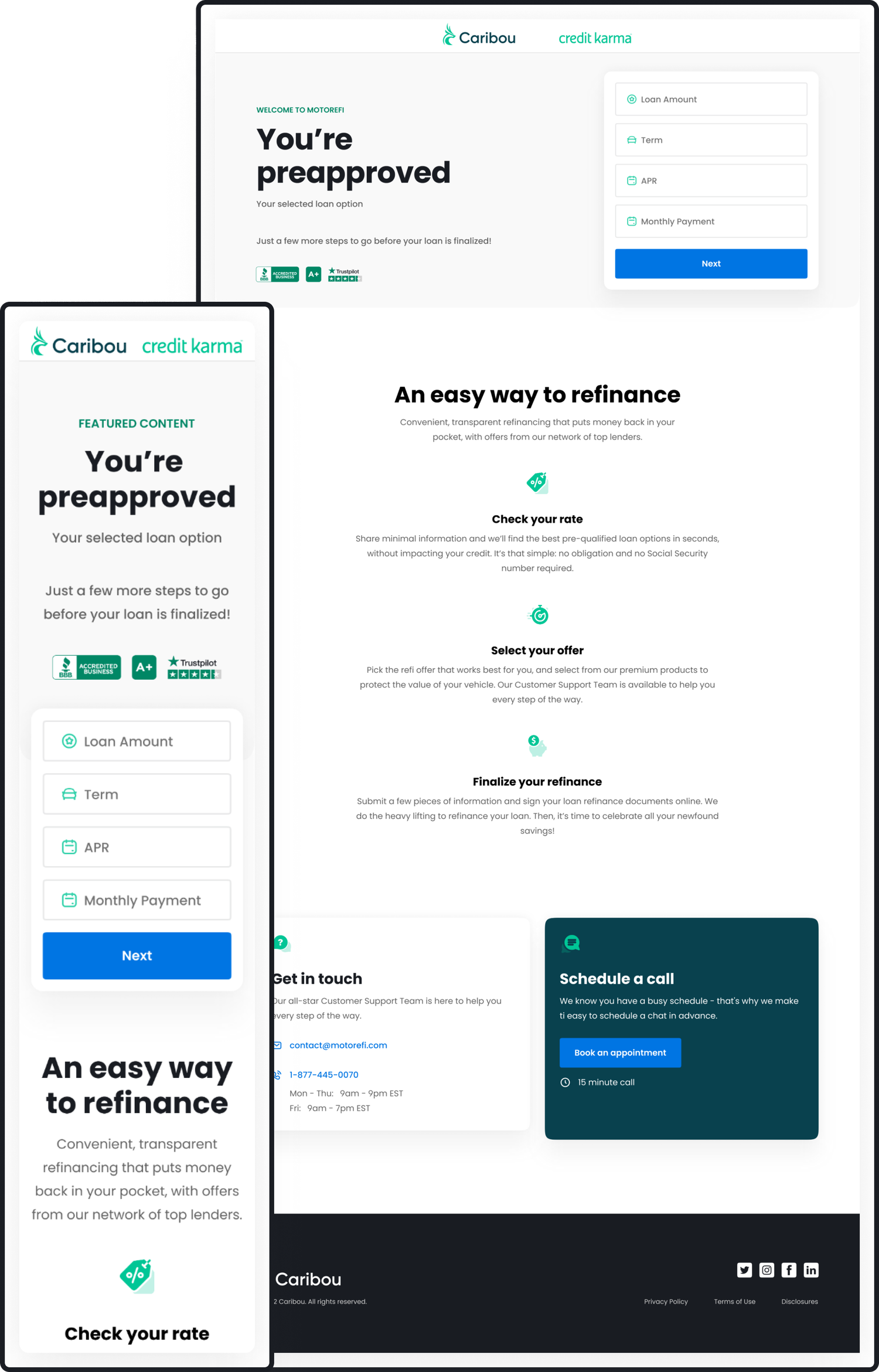
Caribou’s refinance flow was outdated and overly reliant on loan officers to guide users through key decisions. Very few users reached the Offers page independently, and even fewer selected a loan offer without assistance. We heard directly from users and loan officers that the existing experience was confusing, cluttered, and didn’t instill confidence.
Business Goals
• Increase the rate of users selecting an offer without loan officer support
• Build a flexible design system that could support A/B testing and partner-specific personalization
• Build a flexible design system that could support A/B testing and partner-specific personalization
User Goals
• Make the offer options easier to compare at a glance
• Provide clarity around loan terms, fees, and next steps
• Build user trust and reduce drop-off during decision-making
My Role
I led the end-to-end redesign of the Offers page, from research and ideation to prototyping and testing. I worked cross-functionally with product managers, engineers, and business stakeholders, and helped build a scalable, user-informed foundation for future iterations.
• Conducted heuristic and competitive analysis
• Led user testing with both consumers and loan officers
• Developed multiple A/B test variants
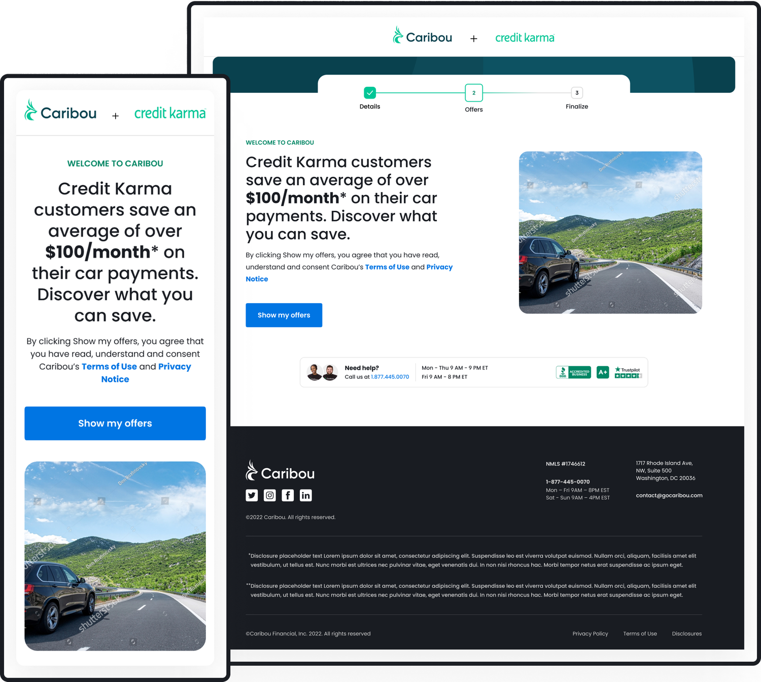
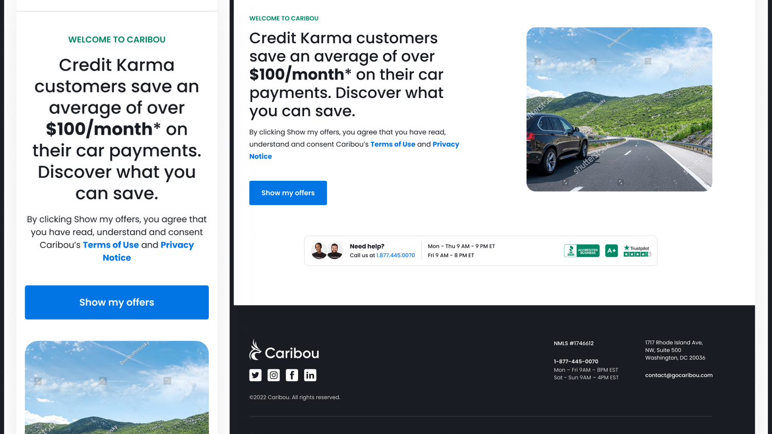
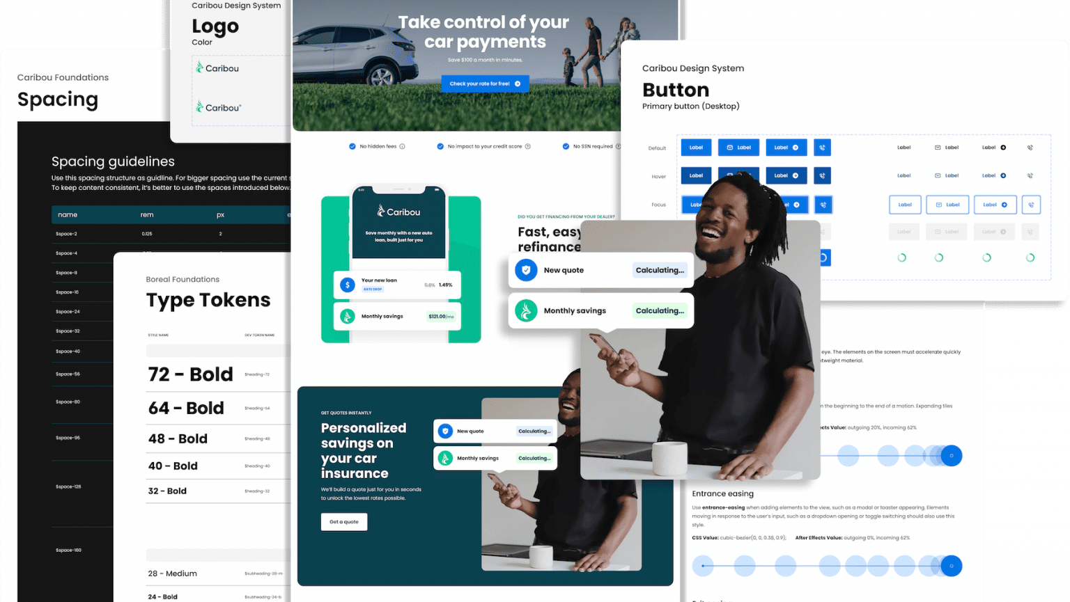
• Designed and iterated on the partner landing page for Credit Karma
• Delivered solutions grounded in both usability and business impact
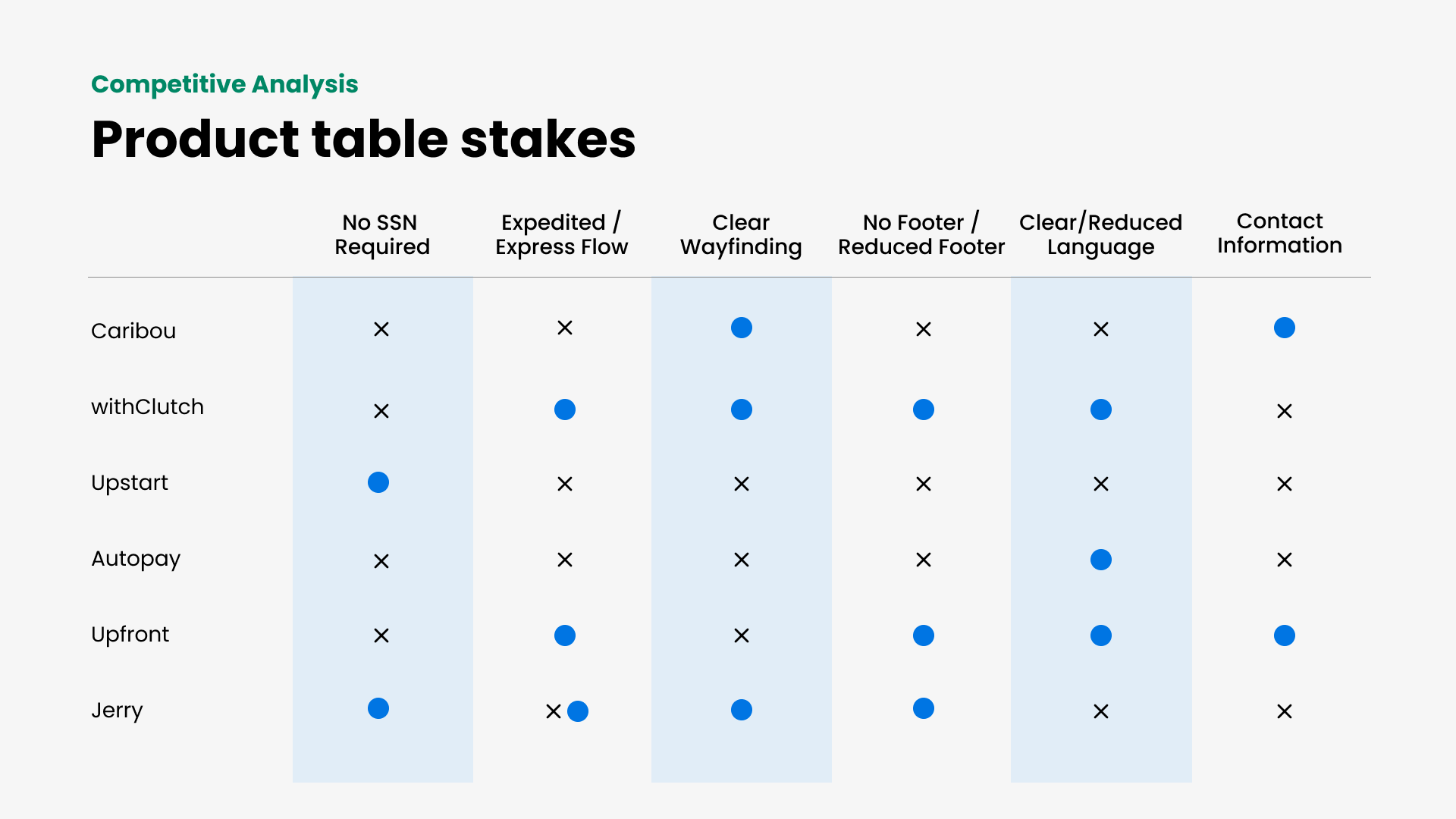
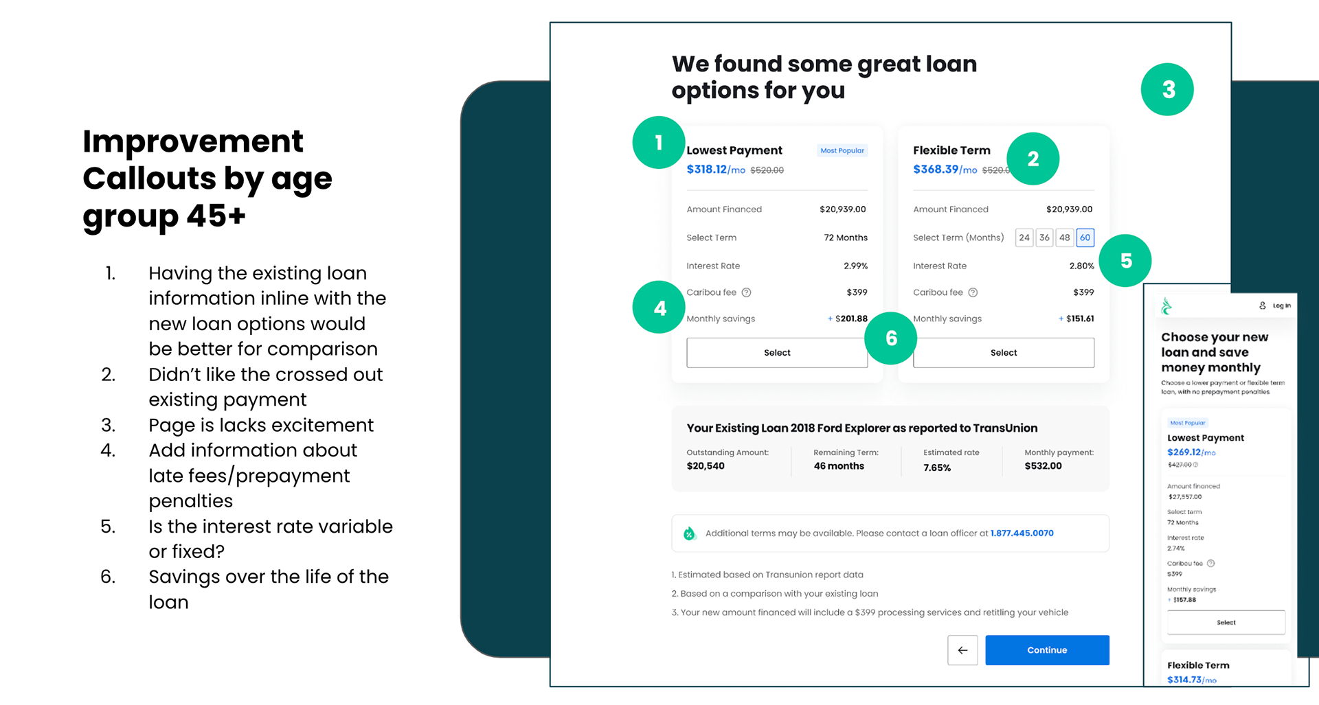
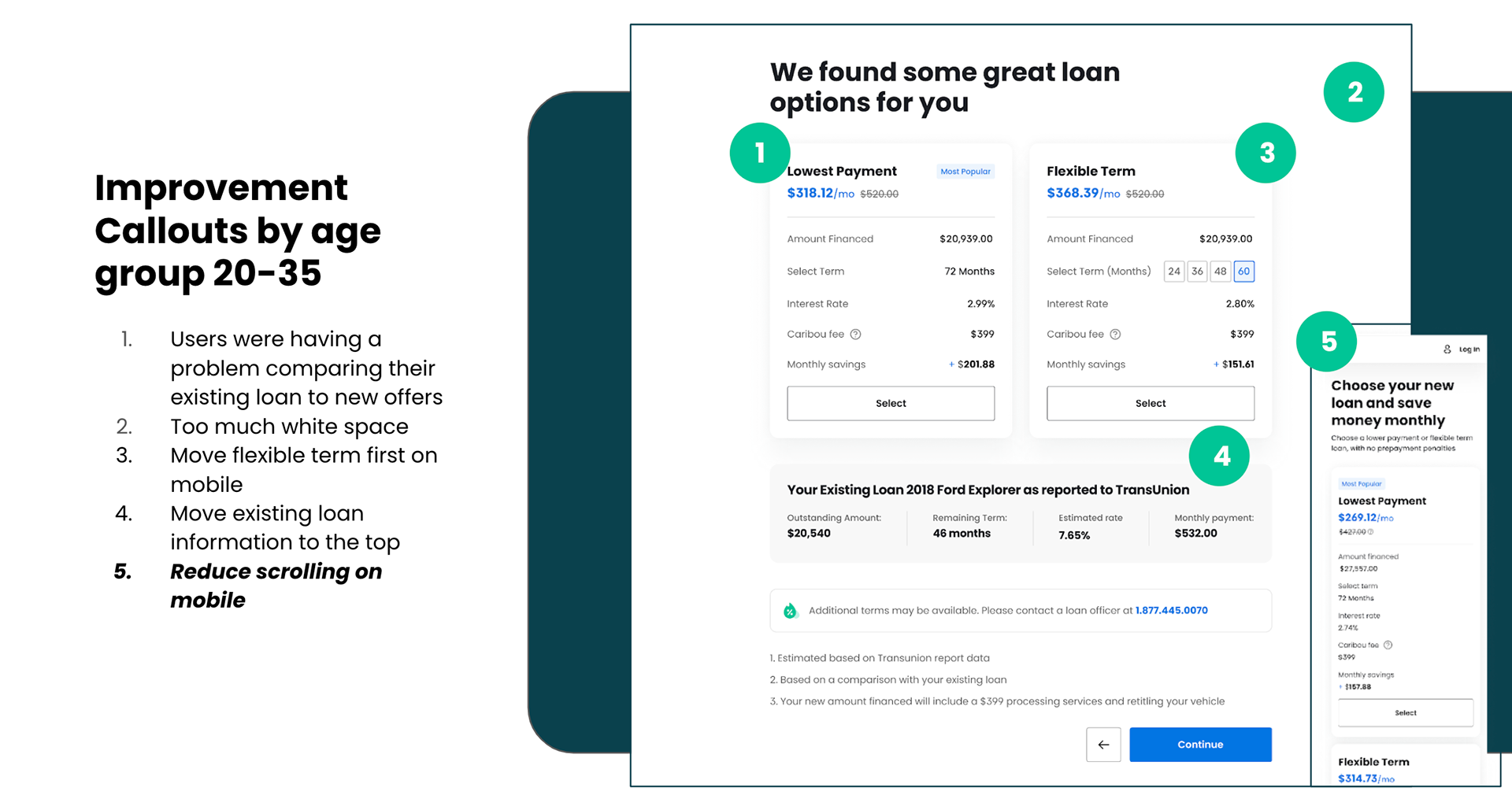
What We Heard
User interviews and internal feedback revealed:
• Confusion around loan terminology and offer structure
• Difficulty comparing current loans to new offers
• Unclear call-to-actions and poor visual hierarchy on mobile
• Lack of personalized context, especially for users coming from partners like Credit Karma

What We Did
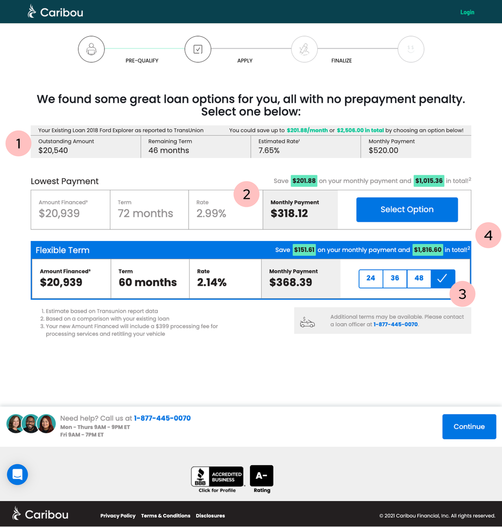
We redesigned the Offers Page with clarity and flexibility in mind:
• Introduced clear comparison modules between current and new loan terms
• Enhanced visual hierarchy with bold, scannable card designs
• Integrated smart defaults and personalization based on user behavior and referral source
• Built variants that could be A/B tested to validate impact
We also redesigned the Credit Karma landing page, resulting in a 63% increase in users who progressed from the landing page to viewing and selecting offers.
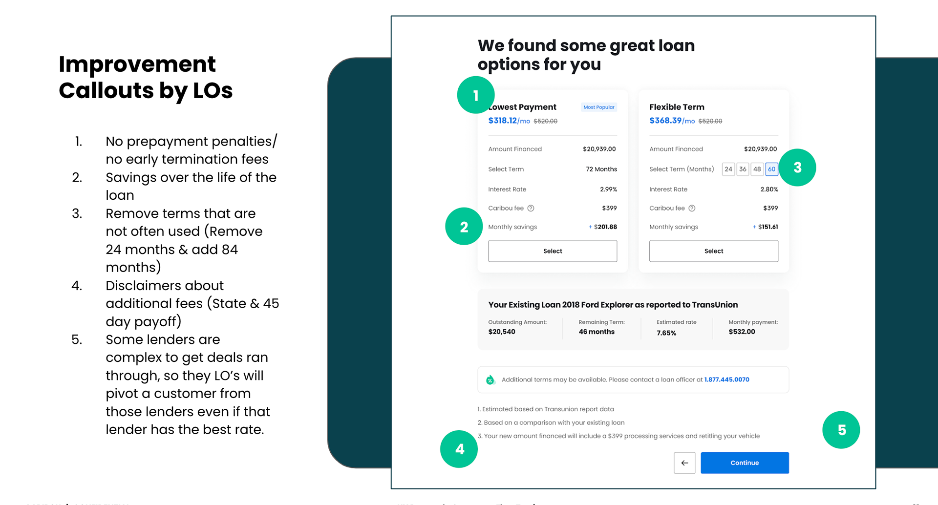
Testing & Iteration
We ran multiple rounds of A/B testing across:
• Card layout and mobile interactions
• Highlighting APR vs. monthly payment
• Swipe behavior for flexible terms
• Visual indicators for selected term buttons
Each variant was evaluated based on impact to conversion and user comprehension. In one test, we discovered that replacing the monthly payment with APR caused confusion, users misread “flexible term” as a flexible interest rate. Based on that insight, we retained the monthly payment and created a distinct visual treatment for APR. Stakeholders aligned with our recommendation.
Results
• Improved user selection rate (final metrics not available due to company-wide layoff)
• 63% lift in engagement from Credit Karma users
• Established a new foundation for scalable A/B testing and future partner integrations
Takeaway
This project wasn’t just about redesigning a page, it was about designing a smarter, more human-centered decision point in the refinance journey. We turned a high-friction step into an opportunity for clarity, trust, and better outcomes.